Aussie, Aussie, Aussie, Oi, Oi, Oi
As part of my non-existent development of my non-existent political idealogy, I've recently been thinking of a new flag for Australia. This isn't just an idea I have, and thus I've stumbled across the apolitical organisation AusFlag.
According to AusFlag; Australia is only one of three UN nations with a defaced Union Jack for a flag, almost all polling shows majority public DISFAVOUR towards the current flag, and a majority never really selected our current flag anyway. Other useful information on the site is that Australians didn't really fight under our current flag in the major World Wars, our flag is easily confused with New Zealand's, and that Queensland's first flag really takes the prize for piss poor planning. Also a lot of flag designers like the Southern Cross, I personally think its a bit unpractical - it makes it hard for the kiddies to draw at school.

In terms of planning Ausflag's competition guidelines provide some nice rules towards planning a good flag. Tips on uncluttering, non-dating and simple colorful designs that work on reality based flags (need to move, fold, obscure, reduce and enlarge etc.)

In terms of the flags, I really like the idea, look and concept of the Reconciliation Flag (pictured on the right). I also liked the red earth, yellow sun and bounding kangaroo flag, its definitely better than the roadkill kangaroo flag (pictured on the left). This one is also nice, I wonder if the squiggly bit is a homage to the Rainbow Serpent, a core creator/guardian spirit in Australian mythology.
My other picks out of their numerous galleries are:
What are my deisgns for a flag?
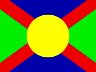
I want something simple. Lines and Circles. No Stars. No Crosses. No writing. No crests or other fancy emblems. No kangaroos. Meaningful colors. I don't want black or white, both have racial connotations.
Green - Life; Australia has a very important ecosystem with high levels of biodiversity on precarious edge. Red - the Earth; this also represents the people, "dust to dust" and all that, the land has also been very important in Australia's history and prehistory. Blue - Ocean; as our national anthem mentions, our land is girt by sea, water is a highly valuable commodity on the driest continent, and so its importance should be represented. Yellow - Sun; the sun is a very strong influence on Australian life, yellow also relates to gold.
My two basic designs are either the cross based one, or the geographically representative horizontal one (red, gold, green, blue - land, gold, rainforest, ocean). Yeah, they're shit. I did that 12:30am in 5 minutes. They also look pretty bright and African/Carribean.


Anyway, it's just idle thinking. It's good for you.
If you could recreate this nation, what would you do?
Labels: ausflag, australia, change, colours, design, flags, gift ideas, kangaroo, opinion, progress, southern cross, union jack


1 Comments:
I think the color problem has to with using basic tones. A more ochre red, golden brown, and probably changes to the green and blue would be good.
Post a Comment
<< Home